The browser is absorbing jobs that used to belong to libraries. That sounds like simplification—until a team ships the native feature and keeps the old JavaScript too.
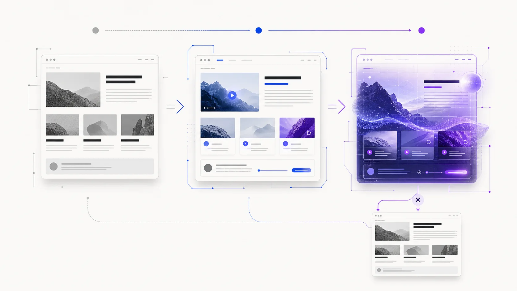
The useful map is not “new versus old.” It has three clusters: foundations that protect the task, primitives that can replace named custom code, and weak signals that belong beside the product rather than inside its critical path. The dividing line is whether the previous implementation can actually be deleted.
Signal cluster 1: the document remains the product
Start with headings, links, buttons, forms and content that preserve their meaning without animation or experimental graphics. This is not an old-fashioned fallback. It is the layer search engines can understand, assistive technology can navigate and every later enhancement can return to.
At this stage, define the real support target from your audience. A feature being demonstrated in one current browser is not a release criterion. The criterion is that the important journey—reading, signing in, filtering, buying or publishing—still completes for the users you serve.
Signal cluster 2: components respond to their real space
Container queries allow a card, toolbar or results panel to adapt to the space it receives rather than the viewport. That makes a component portable across a full-width page, sidebar and dashboard grid without page-specific breakpoint arithmetic. Style queries extend the idea by responding to computed custom-property values on a parent.
This is the kind of browser capability that can remove custom code. The important accounting rule is literal: remove the listeners, duplicated markup or layout library it replaces. Shipping both systems preserves the maintenance cost and adds another failure mode.
Signal cluster 3: move the object without resetting it
The moveBefore() method can reparent a DOM node without restarting its video, reloading its iframe or discarding focus. That matters when a responsive interface moves the same player, editor or live panel between regions. The user keeps the object they were interacting with rather than receiving a synchronized copy.
For teams building adaptive interfaces across mobile and desktop, this principle mirrors the state-continuity problem in our Android 17 migration guide: a visual rearrangement must not erase the task.
The force behind motion: continuity, not spectacle
Same-document and element-scoped view transitions can connect interface states without blocking interaction. Use them when motion answers a spatial question: where did this card go, which result changed, or how did this panel become the detail view?
Do not use motion as proof of modernity. Respect reduced-motion preferences, keep controls available and remove any transition that delays the next action. If a reader cannot explain what the animation clarified, it is decoration competing with the task.
The content remains readable, controls still submit and navigation still has a destination. If the page becomes blank, progressive enhancement was never implemented.
A cautious production signal: reusable CSS logic
The @function rule lets authors define reusable CSS functions with local arguments and a returned result. Alongside style queries and if(), it can move some theming and responsive decisions out of preprocessors. The attraction is real; so is the need for support checks and readable fallbacks.
Keep the first adoption narrow: one theme calculation or component rule that currently produces duplicated code. Measure the result in shipped CSS, maintenance effort and user-visible behavior—not in novelty.
The weak signal: HTML enters the canvas
Chrome’s experimental HTML-in-Canvas work places real DOM elements inside a canvas through layoutsubtree. The promise is unusual: text and controls can remain searchable, accessible, translatable and compatible with browser features such as autofill while WebGL or WebGPU changes presentation.
That could matter for data visualization, creative tools and spatial web interfaces. It is still origin-trial territory. Prototype it beside the product, measure keyboard and assistive-technology behavior, and preserve access to the content without the experiment. If you are considering a spatial experience, compare the attention tradeoffs in our smart-glasses development analysis.
The decision horizon
- 1Now: semantic baseline, audience support target, accessibility and fallbacks.
- 2Next release: one stable primitive that replaces named custom code.
- 3Measured rollout: transitions or reusable CSS logic behind support checks.
- 4Lab: HTML-in-Canvas and other trials outside sign-in, checkout and publishing.
Back where we started: what can the team delete?
Browsers are absorbing work that once required libraries, but every native primitive creates a transition period. Will your team actually delete the previous implementation, document the fallback and monitor interaction errors after release? If not, the new API may make the system heavier before it makes it lighter.
Continue with the Neyrotex web development desk for platform analysis and implementation choices. Neyrotex can also review a product journey and separate meaningful interaction from expensive decoration. Send the flow that feels slower or more fragile than it should.