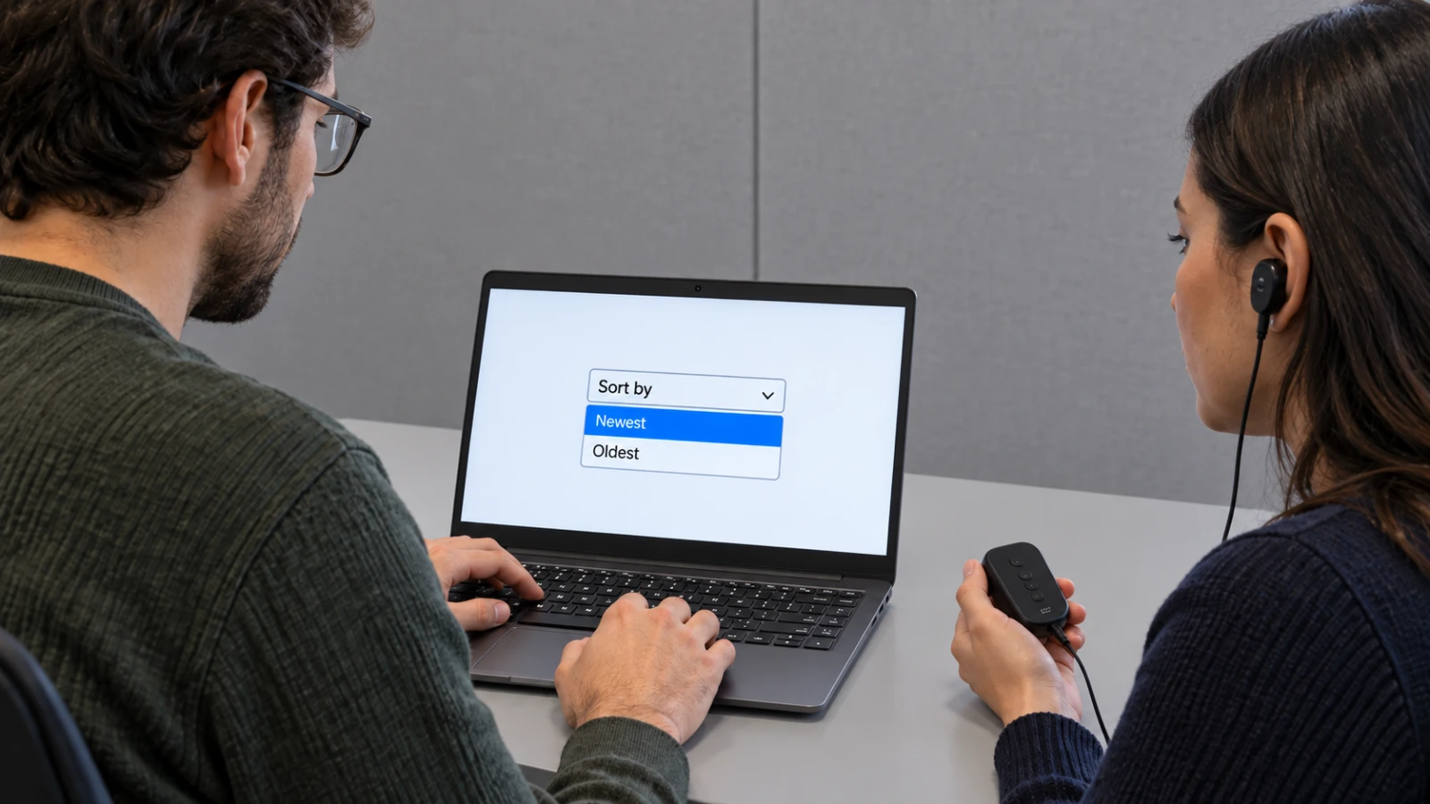
The control looks finished when the button matches the design system and the picker opens with polished motion. Its real test arrives with a keyboard, a screen reader, a long translated option, and an older browser.
Safari 27 customizable select support gives web teams a standards-based styling surface through appearance: base-select. WebKit’s guidance pairs that freedom with one rule: preserve text inside each option so the browser and assistive technology retain a meaningful fallback.
Start the Safari 27 customizable select with native HTML
Write the field as a normal label, select, and text-bearing option elements. The value, required state, form submission, accessible name, and option text should work before any custom CSS runs.
WebKit’s golden rule asks authors to keep text as a direct descendant of each option. Rich visual content can sit beside that text, but the text gives the browser a stable string for fallback rendering and accessibility.
Opt in with appearance: base-select on the control and picker. Safari 27 and Chrome 135 support the model described by WebKit; another browser can ignore the declaration and render its familiar native control.
The control has four styling surfaces
- Closed button: the select box shown in the form.
- Picker: the popup reached through
::picker(select). - Indicators:
::picker-iconand::checkmark. - Selected content: the current option rendered through
selectedcontentwhere the design needs it.
Style the closed control first
Match height, border, color, spacing, and type with the surrounding fields. Keep a visible label outside the control and preserve a focus indicator with enough contrast against every field state.
Use ::picker-icon to adjust the disclosure marker without replacing the whole control. The icon should still communicate that the field opens a list, and it should respond when :open applies.
Test at 200 and 400 percent zoom before adding motion. A fixed height can clip a translated value or force the icon over the text. Let the button grow where your product supports large text.
Build the picker around selection work
The WWDC session shows how the picker pseudo-element exposes the popup for CSS. Use that surface for spacing, border, shadow, color, and entry motion while keeping each option recognizable as a choice.
::checkmark can mark the selected option. Do not rely on color alone, and do not hide the marker unless another persistent cue makes the selected state clear.
Use selectedcontent when the closed button needs the selected option’s rich content. Keep the direct option text, and verify that icons or images do not create a duplicate accessible name.
Protect the native fallback
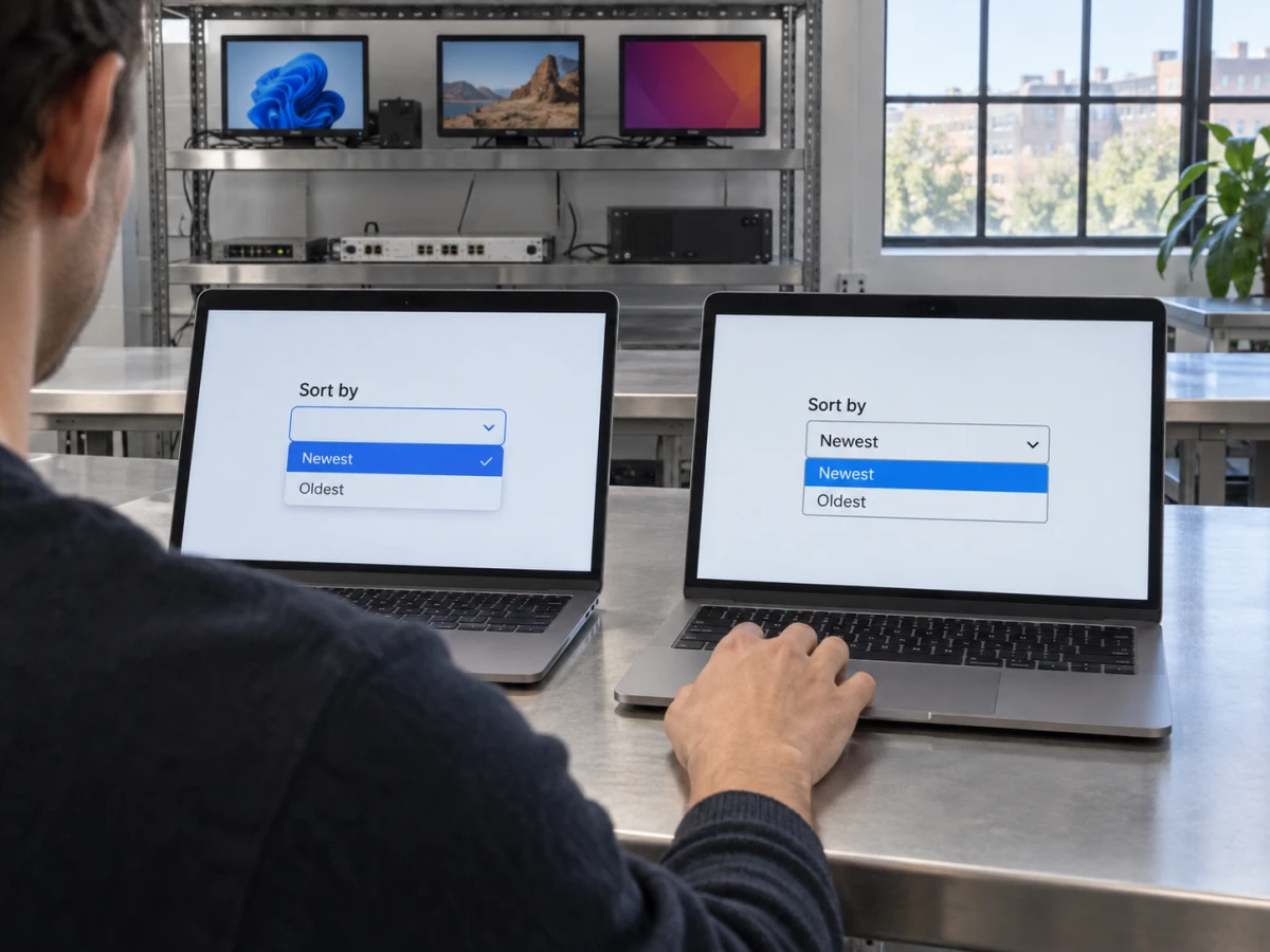
Wrap styling that depends on the new model in @supports (appearance: base-select). Unsupported browsers ignore the opt-in and keep the native control, which preserves a working choice without a JavaScript replica.
A native fallback can look different from the mockup. Accept that visual difference when the label, options, value, focus, keyboard behavior, and form submission remain correct.
Avoid a user-agent branch. Feature support can change across Safari releases, embedded web views, and enterprise update schedules. The CSS support query follows the capability that the page uses.
Run the interaction matrix
Open the control with mouse, touch, Space, Enter, and the platform’s expected arrow-key path. Move through options, choose one, cancel the picker, tab away, return, reset the form, and submit it.
Test VoiceOver on macOS and iOS where your product serves those users. Listen for the field label, current value, expanded state, option names, selected state, and any error that appears after validation.
Use long labels, duplicate prefixes, disabled options, option groups, required fields, and right-to-left text. A decorative icon should not crowd out the words that distinguish one choice from another.
Respect prefers-reduced-motion. A picker can appear without a scale or slide animation, and focus should land in the same logical place whether motion runs or not.
Turn on forced colors and a high-contrast system theme. Borders, focus, selected state, and the disclosure icon need system color fallbacks because a custom shadow or brand fill can disappear under the user’s palette.
Trigger native and server-side validation with the picker closed and open. The error message should identify the field, move focus to a useful place, preserve the attempted value, and remain connected through aria-describedby or the framework’s equivalent.
Ship with a small compatibility contract
Record the browser versions, operating systems, zoom level, input method, and assistive technology used in acceptance. Add one automated form test for value and submission, plus a visual check for the closed and open states.
Apple lists Safari 27 as the current release. Keep the support query after adoption because your traffic can include older Safari builds and in-app browsers long after the desktop update.
The Neyrotex top-level await migration covers a separate Safari 27 change. Our Chrome 153 checklist handles another engine. Follow the Web hub for standards and browser work.