An embedded comments panel receives a message from its child document, updates height, triggers another observation, and sends a second message. The page jitters between two values while a nested scrollbar appears on mobile.
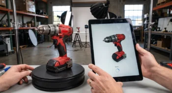
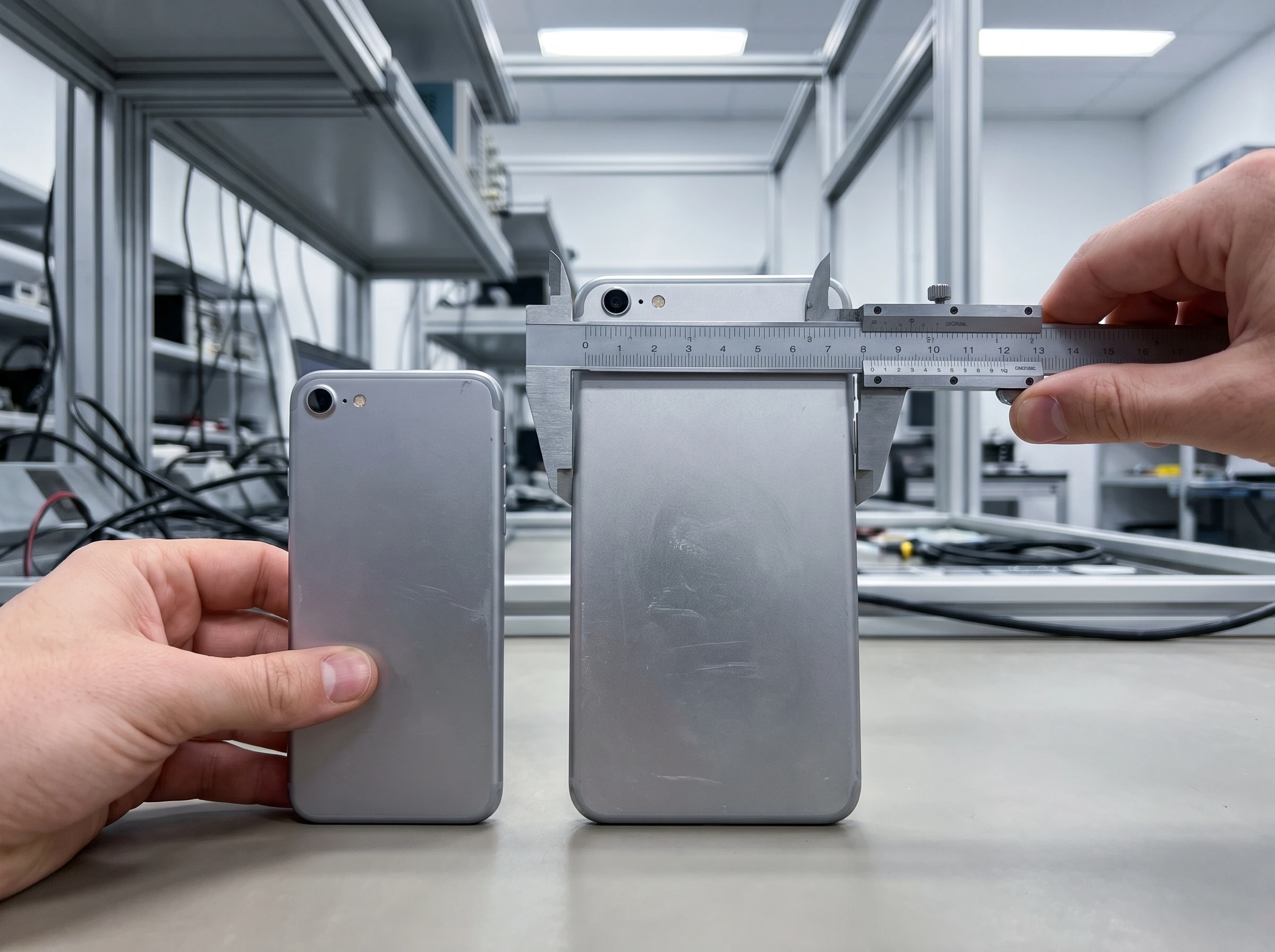
The photographs use a laptop back, tablet back, calipers, a narrow device back, a wide device back, and a caliper as sizing-test props. No depicted screen claims to show Chrome or the child document.
Chrome’s responsive iframe guide describes the platform path introduced in Chrome 154. Current Chrome releases are newer, but teams can remove custom messaging only after the native behavior and the fallback pass the same fixtures.
Confirm the Chrome 154 responsive iframe contract
Chrome lists the capability in its 154 release notes. Treat the stable release as one supported implementation, then check the product’s actual browser matrix before changing the default path.
Feature detection with @supports (frame-sizing: content-height) should choose behavior, while analytics records browser and selected path for diagnosis. User-agent parsing cannot prove the feature is enabled, behaves correctly in an embedded webview, or survives an enterprise policy.
The host applies frame-sizing: content-height, while the child must opt in before load with a responsive-embedded-sizing meta element and explicit allowed origins. Do not inject that permission after the document has loaded or use a wildcard where the embed relationship can be named.
Bound the width before accepting intrinsic height
The host document owns available width, margins, maximum size, and placement in the reading order. Give the iframe a stable inline size and a bounded maximum height so hostile or accidental child content cannot expand the page without limit.
Reserve a starting area to reduce movement before child content becomes available. The first viewport can still shift before intrinsic height settles, so measure cumulative layout shift and the movement of controls below the embed under a cold cache and throttled connection.
Claim-to-fixture ledger
- Native sizing: child content changes produce one stable host size.
- Fallback: unsupported browsers retain the proven message path.
- Security: origin checks and sandbox boundaries remain explicit.
- Usability: focus, zoom, print, scroll, and back navigation remain coherent.
Design a fixture that exposes resize loops
Create child states for short content, long content, an expanding disclosure, a late image, a validation error, dynamic type, and a removed block. Drive the host through narrow and wide widths while recording every size change.
When script changes the child DOM after load, call window.requestResize() after the intentional mutation. That request makes dynamic resizing explicit and gives the fixture a precise event to observe.
A passing result reaches one stable geometry after each intentional mutation. Fail the test when host and child alternate between measurements, when nested scrolling appears, or when the iframe keeps growing without new content.
Keep cross-origin security separate from sizing
Responsive sizing does not grant the host access to cross-origin document data. Preserve the iframe’s security boundaries and the CSS Sizing Level 4 origin contract, including sandbox, allow, referrer policy, permissions policy, content security policy, and exact origin validation.
If the old message channel carries commands or analytics as well as height, remove only the sizing responsibility. Audit remaining message types, require an exact origin and source window, validate payload shape, and ignore unexpected fields.
Run native and legacy paths from one fixture
Record the host width, content height, layout shift, scroll behavior, and fallback path for each fixture. Use the same child document, content mutation, viewport sequence, fonts, and network conditions so the comparison isolates the sizing mechanism.
Keep the old path available behind a bounded compatibility branch during rollout. Track which path each session used and whether it produced overflow, blank space, repeated resizes, or an interaction failure.
Test embedded content that changes after interaction
Comments, forms, checkout steps, support widgets, and collaborative documents often grow after the user acts. Test validation messages, lazy media, localized copy, consent panels, virtual keyboards, and accessibility zoom rather than measuring the initial render alone.
Verify focus remains on the expected control after geometry changes. A correct height can still create a poor experience if the focused element moves beneath a sticky header or the host scrolls without user intent.
Plan a cross-browser fallback without duplicate authority
Keep one sizing controller active per session. Native support should disable the height-message observer, while the fallback should avoid CSS that competes with the posted value.
Expose the selected mode to test code and diagnostics, not to ordinary page content. A controlled switch makes field failures reproducible without turning browser detection into business logic.
Measure the deletion
Count the removed listeners, observers, message types, retries, and race-condition workarounds. Compare runtime errors, resize events, layout shift, nested-scroll reports, and support incidents before and after the migration.
Code deletion is useful when the browser owns the same responsibility with equal or better behavior. Keep the message path if a supported browser or webview still needs it, then remove it when that support window closes.
Roll out one embed class at a time
Start with a low-risk, read-only embed whose content states are easy to enumerate. Expand to forms and authenticated cross-origin tools after the team proves focus, security, mutation, and fallback behavior.
Capture desktop and mobile screenshots for short and long states, but rely on automated geometry assertions for loop detection. A single image cannot prove that a dynamic embed settled after interaction.
Keep a release evidence record
Save the source versions, selected capability, test fixture, expected result, observed result, failure path, owner, and review date together. Recheck the decision when the platform contract, dependency, device class, model snapshot, or business consequence changes; a green launch artifact is evidence for one bounded state, not a permanent guarantee.
Continue with the Web hub, then use our first related guide and second related guide to connect this decision to the surrounding platform work. The next-action guide carries the resulting evidence into the following release decision.