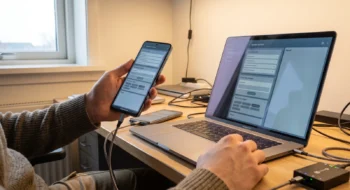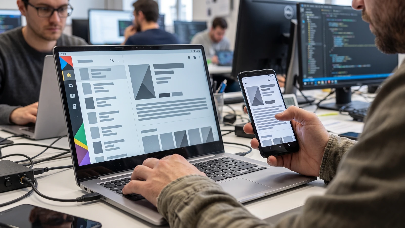
A reading app opens on a laptop and leaves a phone-width column floating inside a wide window. The controls technically work, yet the user loses the space, precision input, and multitasking that made the new device useful.
Google’s Googlebook guidance says developers do not need a separate app. They do need adaptive layout, desktop fundamentals, and differentiated input and window behavior.
Make a Googlebook adaptive Android app follow the window
Free-form desktop windows can change size at any moment. Google’s adaptive-app guidance says to respond to available window space through window size classes rather than physical display dimensions.
A large laptop screen can still hold a narrow app window, and an external display can carry a compact split. Read the app window, not the product label, then keep each destination’s state when the layout changes.
Turn navigation into panes, not stretched margins
Google’s adaptive-navigation guidance supports switching navigation presentation with window space. Navigation 3 scene strategies such as ListDetailSceneStrategy and SupportingPaneSceneStrategy can place a list beside detail or expose a supporting pane.
Choose the pair from the user’s job. Mail, documents, products, conversations, and settings often have a clear list-detail relationship; analytics or creation tools may need a primary surface with a supporting inspector.
Claim-to-test ledger
- Adaptive panes: resize through compact, medium, and expanded widths without losing selection.
- Desktop input: reach every action by keyboard and pointer.
- Multi-instance: open two independent tasks and restore each state.
- Readable density: cap line length and preserve deliberate whitespace.
Keep the back stack as the source of truth
Do not create one navigation model for phones and another for laptops. Let the adaptive scene decide how many destinations are visible while the back stack retains the logical journey.
When the window narrows, the detail pane should become the current destination rather than disappear. When it expands again, the selected item and scroll position should return without a duplicate screen or an unexpected back step.
Add precision input as product behavior
Google calls out physical keyboard navigation, pointer selection, contextual cursors, right-click menus, hover states, and discoverable shortcuts. These are not ornamental laptop features; they determine whether repeated work feels efficient.
A layout can look adaptive and still fail when focus disappears, a pointer target is too small, or a second window restores the wrong destination. Define visible focus, logical traversal, context-menu parity, and shortcut conflicts before polish.
Use Grid and FlexBox for content, not for navigation state
Grid and FlexBox can arrange cards, tools, and metadata inside a pane. Keep destination ownership and state in the navigation layer so a visual reflow does not accidentally create or destroy the user’s task.
Set maximum widths for prose and forms. Increase information density where comparison helps, but do not expand every line or scatter related controls across the entire display.
Prove multi-window and multi-instance isolation
Googlebook users can work across free-form windows. Open two instances on different records, edit both, resize them independently, background one, and restore the process after system recreation.
Check that deep links, saved state, unsaved changes, and notifications target the right instance. A desktop shell magnifies any assumption that only one task exists.
Build one representative test matrix
Cover compact portrait, compact landscape, medium, expanded, maximum width, and abrupt resize while a modal, selection, or text field is active. Repeat the critical path with touch, pointer, keyboard, and a mixed-input sequence.
Record focus order, pane count, selected item, back behavior, line length, pointer targets, shortcut discovery, and state restoration. Use screenshots for layout evidence and assertions for navigation and state.
Keep this Mobile guide outside the review queue
This article addresses an implementation contract for Android apps. It does not review Googlebook hardware, rank products, publish a “Best” list, or consume any product in the separately owned monthly Mobile review plan.
Release the adaptive state, not a device exception
Keep Googlebook-specific code limited to capabilities that truly differ. Layout, focus, and state restoration should improve Android tablets, foldables, desktop windows, and external displays through the same adaptive rules.
Before rollout, collect one compact-to-expanded recording, keyboard traversal evidence, pointer and right-click checks, two-instance restoration, and a process-death recovery. Those artifacts reveal whether the implementation preserved the user’s task rather than merely rearranging pixels.
Keep a release evidence record
Save the source versions, selected capability, test fixture, expected result, observed result, failure path, owner, and review date together. Recheck the decision when the platform contract, dependency, device class, model snapshot, or business consequence changes; a green launch artifact is evidence for one bounded state, not a permanent guarantee.
Continue with the Mobile hub, then use our first related guide and second related guide to connect this decision to the surrounding platform work. The next-action guide carries the resulting evidence into the following release decision.