Google Unveils Stunning New ‘G’ Logo Design Shift!
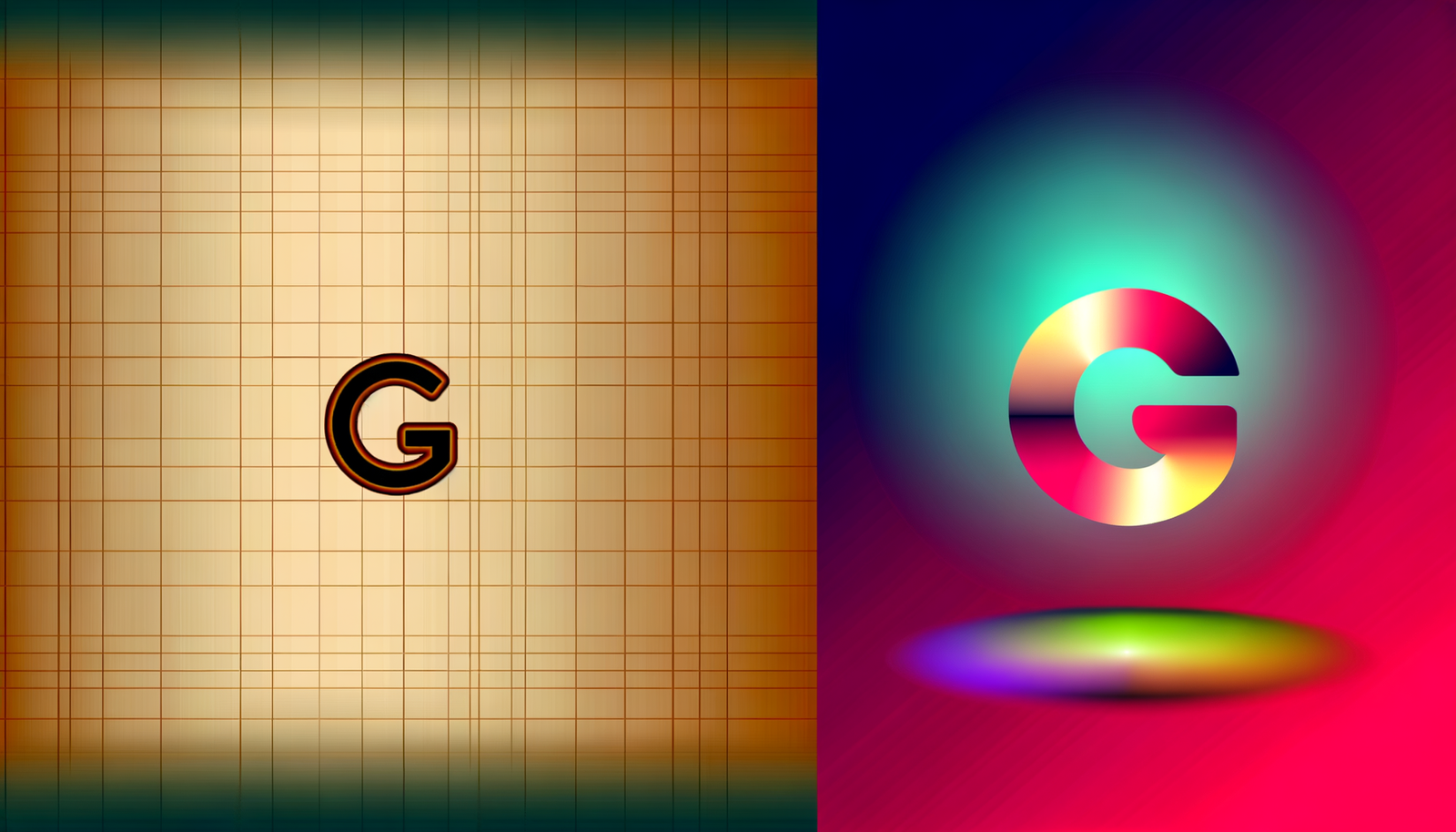
In an exciting move that has captivated the tech world, Google unveils a stunning new ‘G’ logo design shift! This fresh take is not just a cosmetic change; it symbolizes Google’s commitment to innovation and a brighter digital future. The revamped logo, as showcased above, features a sleek and modern aesthetic that reflects the brand’s evolution. As we dive deeper, we’ll explore the significance behind this transformation and what it reveals about Google’s vision moving forward. Do you see it? Let’s take a closer look at the design elements that make this logo stand out!
The Aesthetic Evolution of Google’s ‘G’
Google has long been known for its playful and functional branding, strategically using the alphabet to convey simplicity and user-friendliness. The new ‘G’ logo retains its foundational essence while stepping forward with a contemporary twist. The change features a vibrant gradient effect, transitioning smoothly between shades of blue, red, yellow, and green. This lively color palette is fast becoming a staple in modern design, addressing a trend that seamlessly merges creativity and accessibility.
Why the Gradient?
The addition of the gradient is more than just a visual embellishment; it represents depth and dynamism. As the digital landscape continues to evolve, so do its aesthetic demands. Google’s use of gradient reflects an understanding of this evolution, embodying a sense of movement and engagement. When you look closely, the gradient also symbolizes the interconnectedness of Google’s various services—from Google Search and Maps to YouTube and Drive. This connectivity is at the heart of Google’s mission to organize the world’s information and make it universally accessible.
Inspired by User Interaction
The design shift has also been inspired by user feedback, which has highlighted the need for a visually striking yet legible logo that reflects the brand’s modernity. Designers at Google were keen to ensure that the new ‘G’ logo maintains its strong visibility across various platforms and devices. After extensive research and testing, they crafted this new emblem with a typeface that emphasizes clarity and legibility. This focus on accessibility aligns perfectly with Google’s ethos of usability.
From Flat To Forward-Thinking
While the previous iteration stood firm on a flat design, marking a minimalist approach, the new gradient acts like a bridge to the future. It mirrors the growing trend towards more three-dimensional, textured graphics within both tech and general media. The fuller, more colorful design promises to catch the eye in a world that often feels monochromatic. It’s bold, it’s modern, and it carries with it a sense of fun! After all, this is Google we’re talking about—a company that thrives on creativity.
The Emotional Connection
Beyond colors and shapes, the new logo instills an emotional connection among users—something crucial for any brand aiming for longevity in a competitive environment. First impressions matter, and Google understands this wholeheartedly. With this fresh outlook, they are not just representing a single entity or service; they are embodying a lifestyle choice—one rooted in innovation and reliability. The vibrance and approachability of the new design invite a sense of familiarity, making users feel comfortable navigating the tech giant’s array of tools.
Logo Application Through Different Mediums
As the world increasingly turns toward digital interfaces, how a logo appears on various platforms becomes vital. The adaptability of the new ‘G’ ensures it works flawlessly across mobile apps, desktop sites, and even physical spaces. Whether you are accessing Google from a smartphone while on the go or within an office desktop, the logo is strikingly visible, ensuring that users are always reminded of the brand they deeply trust.
What’s Next for Google’s Brand Identity?
This logo refresh may signal more than a mere aesthetic update; it lays the groundwork for future innovations within the company’s branding strategy. As Google continues its forward march into augmented and virtual reality, artificial intelligence, and machine learning, the logo could evolve even further. Although today’s unveiling is a monumental step, it also leaves open the exciting possibility of future modifications that could accompany advancements in technology.
The Road Ahead
As part of their commitment to being user-centric, Google is likely to use feedback from consumers to refine the logo further. The transition offers not just an identity shift but also an invitation for users to engage with the company as co-creators of their evolving brand narrative. After all, the most effective brands are those that listen to their audience and adapt their messaging accordingly. Given the rapid influx of new technology, Google could use its new branding to invite more user input on future updates and features.
The Takeaway
Google’s stunning new ‘G’ logo design shift is more than an aesthetic makeover. It’s a bold statement that clarifies the tech giant’s core values of innovation, accessibility, and community. By embracing a vibrant and modern gradient, Google has tapped into a deeper connection with its users—one that is engaging, dynamic, and full of possibilities.
As we witness this exciting evolution in branding, we can’t help but wonder what the future holds for Google and its users. The design shift is not merely a cosmetic change; it signifies a renewed commitment to creating a positive digital environment. This isn’t just about a logo; it’s an affirmation of Google’s vision of a brighter, interconnected world.
Join the Conversation!
What do you think of the new ‘G’ logo design? Will it change your perception of the brand? Share your thoughts, and let’s dive into the discussions about how design influences technology, branding, and user experience today!
For further reading and an in-depth look at the implications of design in technology, check out Neyrotex.com.


